
Instagram carousel structure gives every slide one job. Slide 1 earns the swipe, slide 2 confirms the payoff is coming, the middle slides deliver one idea each, and the last slide asks for one action. Build at least one slide worth screenshotting, because sends per reach is one of the three signals Instagram weights most in 2026.
Most carousels that flop are not badly designed. They are badly ordered. The idea is on slide 6, the proof is on slide 9, and the ask is buried under a paragraph nobody read. Swipe-through dies at slide 3 and the post never reaches anyone outside your followers.
This guide gives you the slide-by-slide structure: what each position in the deck has to accomplish, which slide decides your reach, how many slides to run, and how to build the last slide so the people who swiped end up in your DMs instead of guessing at your bio link.
Key Takeaways
- One job per slide. Cover earns the swipe, slide 2 confirms the payoff, middle slides carry one idea each, last slide carries one ask. A slide doing two jobs does neither
- Sends decide reach, not swipes. Adam Mosseri has named watch time, likes per reach, and sends per reach as the signals Instagram weights most. A carousel spreads when someone forwards it in a DM
- Build one screenshot slide. The single slide someone would send to a friend or save for later is the structural center of the deck. Design the rest around it
- Carousels still lead on engagement. Carousels averaged 0.50% engagement by follower count in Q2 2026, ahead of Reels at 0.48% and static images at 0.33%, though carousels slipped from 0.52% in Q1 (socialinsider.io, July 2026)
- Slide ceiling depends on how you post. Instagram allows 20 slides in the app, up from 10 since August 2024 (metricool.com, August 2024). Meta’s Content Publishing API caps a carousel at 10 items, so scheduled posts stop at 10 (developers.facebook.com, August 2026)
- The last slide is a conversion surface. Ending on “comment a keyword” and pairing it with an auto-DM that fires on the comment puts the link in the DM while the reader is still in the app
Why Instagram Carousel Structure Changed in 2026
Instagram carousel structure used to be a design question about how to hold attention across ten frames. It is now a distribution question. Instagram’s head, Adam Mosseri, has repeatedly named three signals as the ones that matter most for ranking: watch time, likes per reach, and sends per reach. Sends per reach measures how many people who saw a post cared enough to forward it privately.
That reorders the whole deck. A carousel built purely for swipes optimizes for time spent, which is one signal out of three. A carousel built so that one slide is worth forwarding earns the signal that pushes content to people who do not follow you.
Carousels are well suited to this. They hold multiple frames, so one of them can be a self-contained asset: a checklist, a comparison, a set of numbers, a template. That frame is the one that travels. For the wider picture on what Instagram rewards now, see what changed in the Instagram algorithm.
The format still earns its slot. Carousels averaged a 0.50% engagement rate by follower count in Q2 2026, against 0.48% for Reels and 0.33% for static images, though carousels fell from 0.52% in Q1, so the gap over Reels is narrowing (socialinsider.io, July 2026). For how the formats stack up against each other, see our breakdown of Instagram content formats.
What Each Slide in an Instagram Carousel Has to Do
Every slide position has one job. Slide 1 earns the swipe. Slide 2 confirms the reader guessed right about the payoff. Middle slides deliver one idea each, in the order someone would use them. One middle slide is built to be screenshotted. The final slide carries a single ask. When a slide takes on a second job, both jobs get done badly.
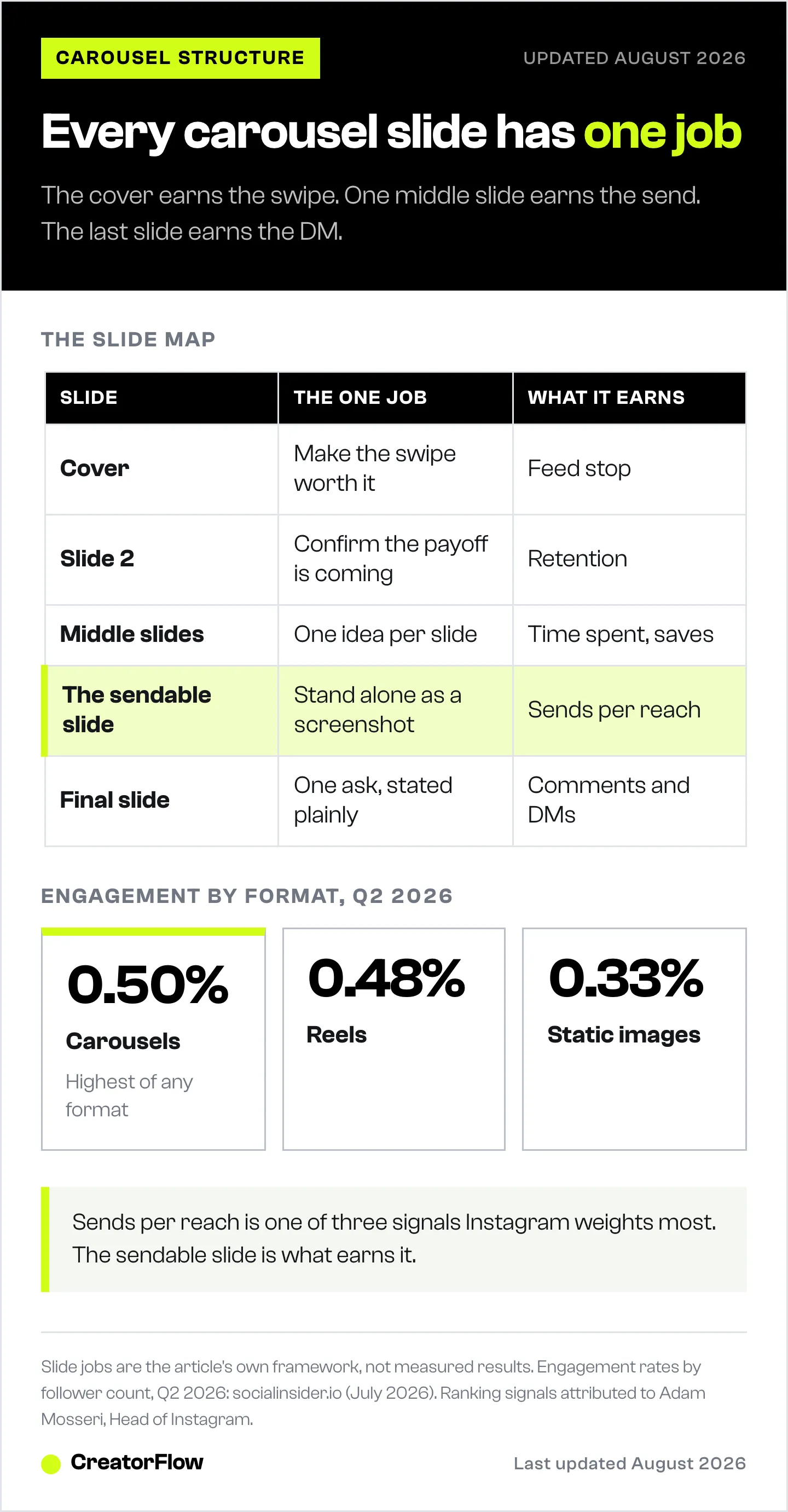
| Position | The one job | What it earns |
|---|---|---|
| Slide 1 (cover) | Make the swipe feel worth it | Swipe-through, feed stop |
| Slide 2 | Confirm the payoff is real and coming | Retention past the drop-off point |
| Slides 3 to 7 | One idea, one slide, in usable order | Time spent, saves |
| The sendable slide | Stand alone as a screenshot | Sends per reach, saves |
| Final slide | One ask, stated plainly | Comments, DMs, profile visits |
Two structural rules sit underneath the table. Every slide has to read on its own, because people enter mid-swipe and screenshot single frames out of context. And the order has to match how a person would use the information, not how you researched it.
How to Structure the First Two Slides
The cover has about two seconds and roughly ten words. It states one claim or opens one gap, and nothing else competes with it. Slide 2 does the job most creators skip: it tells the reader the payoff is real and names when it arrives. Readers drop out early when they suspect the carousel is a wind-up with no delivery.
Three cover shapes that hold up:
- The specific claim. A number and a subject. “Six slides is the sweet spot for saves.” The specificity is what makes it credible enough to swipe.
- The named mistake. “Your last slide is asking for two things.” It works because the reader has to check whether it applies to them.
- The before and after. Two states in one frame. The gap between them is the reason to swipe.
Slide 2 should do one of these: state the stakes in a sentence, name who the carousel is for, or show the finished result up front. Showing the payoff early is the strongest of the three, because it converts curiosity into a reason to keep going. If you want more cover-line options, 50 hook templates adapt directly to a first slide.
Keep both slides to one focal point. Text large enough to read without zooming, high contrast, and no paragraph anywhere in the first two frames.
The Sendable Slide: Why One Slide Decides Your Reach
The sendable slide is the frame someone would screenshot and forward to a friend, or save to come back to. It stands alone with no context from the slides around it. It is usually a checklist, a comparison table, a set of numbers, a script, or a template. Because sends per reach is one of the signals Instagram weights most, this single slide does more for distribution than the cover does.
Ask one question about it before you post: if this frame appeared in someone’s DMs with no caption and no cover, would it still make sense and still be useful? If the answer is no, it is not sendable, it is a paragraph in a nice font.
What makes a slide travel:
- It resolves something. A list of steps, a decision table, the actual numbers. Not a teaser for the next slide
- It is complete without you. No “as we said on slide 3”, no reference to your brand story
- It is legible at thumbnail size. People forward screenshots, and screenshots get compressed
- It has one thing on it. A slide with three frameworks gets sent by nobody
Put it in the second half of the deck, after the reader has enough context to value it, and before the ask. In practice that means slide 6, 7, or 8 in a ten-slide carousel.
How Many Slides Should an Instagram Carousel Have
Instagram allows up to 20 slides in a carousel posted from the app, doubled from 10 in August 2024 (metricool.com, August 2024). Meta’s Content Publishing API caps a carousel at 10 items, so anything published through a scheduling tool stops at 10 (developers.facebook.com, August 2026). Most educational carousels land between 7 and 10 slides, which fits one cover, one setup, four to six ideas, one sendable frame, and one ask.
Slide count follows the structure, not the other way round. Count the jobs the deck has to do and add them up:
- 1 cover
- 1 setup
- 4 to 6 idea slides, one idea each
- 1 sendable slide
- 1 ask
That is 8 to 10. Going past 10 means either the topic should have been two carousels, or you are padding with slides that repeat each other. Going under 7 usually means ideas are being stacked two to a frame, which is what kills readability at thumbnail size.
One practical constraint: if you schedule posts, plan for 10. The API ceiling is not something a scheduling tool can raise. For the exact dimensions, aspect ratios, and design specs behind these frames, see our guide to carousel sizes and slide templates.
How to Structure the Last Slide So It Converts
The final slide carries one ask, phrased as a single action with a single outcome. “Comment TEMPLATE and I’ll send the checklist” works because the reader knows exactly what to type and exactly what arrives. Stacking a follow request, a bio-link mention, and a comment prompt onto one frame splits attention and gets none of the three.
The comment ask outperforms the bio-link ask for a structural reason. A bio link asks the reader to leave the post, tap through to your profile, find the link, and choose from whatever is behind it. A comment keeps them in the post, and the reply arrives where they already are.
That path only closes if something is listening for the comment. This is what Instagram DM automation does: a keyword trigger watches the comments on that post, and everyone who types the word gets your link in a DM within seconds. CreatorFlow runs this on Meta’s official Instagram API as a Meta Tech Provider, and it can add a follow gate so the link goes out after someone follows, or an email gate so you collect the address on the way through.
Pick the keyword carefully. One word, easy to spell, obviously connected to the offer. TEMPLATE, GUIDE, CHECKLIST, PRICING. Our list of comment keywords that convert covers which ones people type and which ones get misspelled into failure.
Repeat the same keyword in the caption’s first line. Half your readers will act from the caption without reaching the last slide.
Carousel Structure Templates by Post Type
Different post types need different middle sections. The cover, the sendable slide, and the ask stay in the same positions. What changes is what fills slides 3 to 7.
| Post type | Slides 3 to 7 | Sendable slide | Ask |
|---|---|---|---|
| Teaching a process | One step per slide, in order | The full step list on one frame | Comment for the template |
| Myth correction | Myth, why it spread, what is true, evidence, what to do instead | The corrected rule, stated plainly | Comment for the source |
| Comparison | One criterion per slide | The full comparison table | Comment for the breakdown |
| Case walkthrough | Starting point, the change, the result, the caveat | The numbers on one frame | Comment for the method |
| Resource roundup | One tool or resource per slide | The full named list | Comment for the links |
The roundup shape is the most reliably forwarded of the five, because the list slide is useful to someone who never saw the cover. The case walkthrough is the hardest to structure, because the result belongs early. Put it on slide 2, then spend the middle explaining how it happened.
Structure Mistakes That Cost You Reach
Five ordering problems account for most underperforming carousels. Each one is a structure fix, not a design fix.
The payoff is on the last slide. If the reason to swipe only resolves at slide 9, most readers never see it. Move the result forward and use the middle to explain it.
Every slide continues the one before it. Sentences that run across frames make each slide worthless as a screenshot. Write every slide as a complete thought.
The sendable slide does not exist. A deck of context with no self-contained asset earns time spent and nothing else. Add one frame someone could use on its own.
The last slide asks for three things. Follow, save, comment, link in bio. Pick the one that matters and drop the rest.
Slide 2 restates slide 1. A cover and a setup that say the same thing waste the position where readers decide whether to continue. Slide 2 has to add the stakes or the payoff.
One more worth naming: a caption that ignores the deck. The caption is where readers who never swipe still convert, so put the ask in the first line rather than at the end of a paragraph. Caption templates built for comments and saves cover the shapes that work.
FAQ
What is the best structure for an Instagram carousel?
One job per slide. Slide 1 earns the swipe with a single claim in about ten words. Slide 2 confirms the payoff is coming. Slides 3 to 7 carry one idea each in usable order. One middle slide is built to stand alone as a screenshot. The final slide carries one ask.
How many slides should an Instagram carousel have?
Most educational carousels work at 7 to 10 slides. Instagram allows 20 when you post from the app, raised from 10 in August 2024 (metricool.com, August 2024), but Meta’s Content Publishing API caps carousels at 10 items, so scheduled posts stop there (developers.facebook.com, August 2026). Let the number of jobs set the count rather than filling to a ceiling.
Which carousel slide matters most for reach?
The slide someone would screenshot and send to a friend. Adam Mosseri has named sends per reach as one of the three signals Instagram weights most, alongside watch time and likes per reach. A cover earns the swipe, but a forwardable slide earns distribution to people who do not follow you.
Do carousels still get more engagement than Reels?
Carousels averaged 0.50% engagement by follower count in Q2 2026, ahead of Reels at 0.48% and static images at 0.33%. Carousels slipped from 0.52% in Q1 2026, so the lead is narrowing rather than growing (socialinsider.io, July 2026).
Where should the call to action go in a carousel?
On the final slide, as one action, and repeated in the caption’s first line. Readers who convert from the caption often never reach the last frame. Asking for a comment keeps the reader inside the post, which is why it tends to outperform sending them to a bio link.
How do I turn carousel comments into DMs automatically?
Set a keyword trigger on the post. When someone comments the word, an automation sends them a DM with your link. CreatorFlow does this through Meta’s official Instagram API and can require a follow first or collect an email before the link goes out. Setup takes a few minutes per post.
Should every carousel slide be readable on its own?
Yes. People enter carousels mid-swipe, screenshot single frames, and forward them without context. A sentence that runs across three slides makes all three useless when separated. Write each frame as a complete thought.
What is the right size for carousel slides?
1080 x 1350 px in 4:5 portrait gives the most screen space in feed, and every slide in the set has to share one aspect ratio or Instagram crops them. Full dimensions for every format are in our Instagram post size guide.
Turn Swipes Into Conversations
Structure gets the carousel read and forwarded. The last slide is where it becomes a distribution channel: one keyword, one automation listening, and the link lands in the DM while the reader is still in the app.
CreatorFlow connects through Meta’s official Instagram API, sets up in under five minutes, and works on a flat monthly price rather than a per-contact ladder. Start with the free plan and put a keyword on your next carousel.
Engagement benchmarks from socialinsider.io/social-media-benchmarks/instagram (July 2026). Carousel slide limits from metricool.com (August 2024) and Meta’s Content Publishing documentation at developers.facebook.com (August 2026). Ranking-signal statements attributed to Adam Mosseri, Head of Instagram. Verified as of August 2026. Individual results vary.