

The best link in bio examples follow one order: the thing your latest post promised sits at the top, your main offer comes second, practical details come third, other links fourth, and social icons last. Below are 10 page layouts by creator type, from an affiliate creator to a local salon. Each one lists its blocks from top to bottom, explains the order and names one mistake to avoid.
Picture the trip a follower makes. They watch your Reel, tap your name, tap your bio link, and land on a page with 14 buttons. None of them is the thing from the Reel. Linktree says about 65% of visitors who reach a Linktree page click a link, and more than half of its monthly clicks start on Instagram, according to its April 2026 trends post (session data from October 2025 to March 2026). People arrive ready to click. The order of your page decides what they click.
This guide is about the page your bio link opens. For the words above that link, see our guide on how to write an Instagram bio and our 60+ bio lines sorted by account type. The layouts below are our own designs for you to copy.
Key Takeaways
- Row 1 is the promise. The top block is the thing your last post, Reel or Story sent people to find. Change it with every post
- Row 2 is the money or the list. Your main offer stays in the same place, so returning visitors find it without searching
- Most attention goes to the first screen. In a Nielsen Norman Group eyetracking study, 57% of viewing time went to the first screenful
- Keep it short when clicks are the goal. Linktree recommends 3 to 7 links for click-throughs, and over seven only for pages built to show a catalog
- Instagram itself allows 5 links in your profile, and up to 20 on the link page that comes with a Meta One plan (checked November 2026)
- Copy the 5-row template below, then swap the blocks for your type: products, events, bookings, episodes or opening hours
- Each layout names one mistake to avoid, with the fix
- Build any layout for free: the More.You page builder, from our team, has a block for each row: links, products, events, bookings, opening hours and FAQs
Link in Bio Examples at a Glance
Every layout below starts the same way: the promise first, the main offer second. Use this table to find your type, then read its full layout.
| Creator type | Row 1: the promise | Row 2: main offer | Rows |
|---|---|---|---|
| Affiliate or fashion creator | Shop the outfit from the latest post | Product cards for that post | 6 |
| Coach or consultant | Free guide from the latest post | Book a call | 6 |
| Musician | New release or pre-save | Upcoming shows | 6 |
| Podcaster | The episode behind the latest clip | Listen on your main app | 6 |
| Local cafe or salon | This week’s special or free slot | Book or order | 6 |
| Digital product seller | The product from the latest post | Free sample | 6 |
| Newsletter writer | The issue the latest post quoted | Subscribe | 5 |
| Photographer or artist | The shoot or piece from the latest post | Book a session | 6 |
| Fitness creator | The workout from the latest post | Paid program | 6 |
| Event or workshop host | The next date, with tickets | All upcoming dates | 6 |
The Rule Behind Every Layout: Lead With What Your Last Post Promised
The top block of your link page should be the exact thing your most recent post told people to find “in bio”. A visitor who taps through from a Reel about a jacket is looking for the jacket. We call this the promise rule. Row 1 changes with every post, and the rows below it stay put, so the page always matches the reason people came.
Three sources point the same way.
Attention falls as the page goes down. In a 2018 eyetracking study, Nielsen Norman Group found people spent 57% of their page-viewing time on the first screenful and 74% on the first two. That study used desktop screens. A phone shows less per screen, so even fewer of your blocks get that first look.
A short list suits clicks. Linktree’s own homepage FAQ recommends 3 to 7 links when click-throughs are the goal, based on its most successful creators. It adds that more than seven suits pages built for display, such as a record label’s catalog (checked November 2026).
Even Instagram builds a “first” slot. Meta’s Help Center says the link page that comes with a Meta One plan holds up to 20 links in the order you add them. It also lets you set a “primary link”, which Meta describes as “the one you want people to see first” (checked November 2026).
So the order is the design. Colors and fonts matter less than which block a visitor meets first.
10 Link in Bio Page Layouts by Creator Type
Each of these link in bio examples lists the blocks from top to bottom. Row 1 always follows the promise rule, so replace it with whatever your newest post sends people to find. If you need link in bio ideas for a type that is not listed, start from the 5-row template after the layouts.
1. Affiliate or Fashion Creator
Who it suits. Creators who post outfits, hauls or product finds and earn a commission on links.
- Shop the latest post: one card with the post’s photo
- Product cards for each item in that post
- Full storefront, for example your Amazon or LTK shop
- Past roundups by theme: work outfits, travel, sale finds
- Brand contact: an email for collaborations
- Social icons
Why this order. A follower who taps from an outfit post wants that outfit. Using the post’s own photo on the first card tells them they are in the right place before they read a word. The storefront sits third for people who want to keep browsing. Add one short line under your name, such as “Some links earn me a commission”, so visitors know how the links work.
Mistake to avoid. One “Shop all” button at the top that opens a storefront with hundreds of items. The visitor came for one jacket and now has to search for it.
2. Coach or Consultant
Who it suits. Coaches who sell calls, programs or group courses.
- The free guide, quiz or replay your last post offered
- Book a call, with the length and price, or “free”
- Your main program, with a starting price
- FAQ: who it is for, how a call works, what it costs
- Client results you have permission to share
- Podcast or newsletter, then social icons
Why this order. Not everyone who taps from a post is ready to book. The free thing from the post gives them a first step, and the booking button sits right below it for the people who are ready. The FAQ answers the questions that would otherwise arrive as DMs.
Mistake to avoid. A long “About me” text block at the top. It pushes the booking button below the first screen, where it gets less attention.
3. Musician
Who it suits. Artists and bands with a release, shows or merch to promote.
- The new release or pre-save your last post teased
- Upcoming shows, with dates and ticket links
- Listen links for the streaming services your fans use
- Merch
- Fan list sign-up
- Booking contact for promoters, then social icons
Why this order. A release and a show both have a date, so they go first. Your back catalog is display content, so it can go lower on the page or on a separate page, as Linktree’s advice for catalog pages suggests.
Mistake to avoid. Leaving the pre-save at the top after release day. Swap it for the stream link the morning the song comes out.
4. Podcaster
Who it suits. Hosts who post short clips from longer episodes.
- The full episode the latest clip came from
- Listen on your main app, then a second app
- The three most recent episodes
- Be a guest, or sponsor the show: a form or email
- Newsletter or community
- Social icons
Why this order. Someone who watched a clip wants the rest of that conversation. A link to the show’s main page makes them search for the episode. Put the exact episode first.
Mistake to avoid. Listing every podcast app as its own big button. Check your podcast host’s stats, pick the one or two apps most of your listeners use, and keep the rest in one row.
5. Local Cafe or Salon
Who it suits. Cafes, restaurants, salons, studios and any shop with a front door.
- What your last post promised: this week’s special, a new service or a free slot
- Book a table, book an appointment or order
- Opening hours and address, with a map link
- Menu or price list
- FAQ: parking, walk-ins, cancellations
- Phone number and social icons
Why this order. Linktree’s May 2026 traffic study found visitors from Google search clicked a link on about 95% of page views, the highest of any source. Linktree’s reading is that “someone searching your name already wants the link”. It adds that some visitors click more than once, so the figures are best used to compare sources. Put booking and hours where these visitors see them first.
Mistake to avoid. A “Visit our website” button above your hours. It adds one more tap for the thing most visitors need.
6. Digital Product Seller
Who it suits. Creators who sell templates, presets, ebooks or courses.
- The product your last post showed, with its price
- A free sample or lead magnet
- Your two or three best sellers
- FAQ: file format, how delivery works, refund terms
- Newsletter
- Social icons
Why this order. With the price on the first card, nobody gets a surprise at checkout. The free sample catches people who are not ready to pay today, and the FAQ answers “how do I get the file?” before anyone asks.
Mistake to avoid. A grid of 12 products in no order. That is far past the 3 to 7 links Linktree suggests for clicks. Show the post’s product and your best sellers, and link the rest as one “All products” row.
7. Newsletter Writer
Who it suits. Writers whose main product is an email newsletter, free or paid.
- The issue your last post quoted: “Read the full issue”
- Subscribe, with one line on what you send and how often
- Your three best past issues
- Paid tier or sponsorship details
- Social icons
Why this order. A reader who liked the quote in your post wants the full issue first. The subscribe button sits directly under it, so it is there at the moment they finish reading.
Mistake to avoid. A subscribe button that only says “Subscribe”. Say what arrives and when: “One email every Sunday with three tools I tested”.
8. Photographer or Visual Artist
Who it suits. Photographers, illustrators and artists who take bookings or commissions.
- The shoot or piece from your last post: a gallery link
- Book a session, or ask about a commission
- Packages and prices
- Portfolio by category: weddings, portraits, brand work
- FAQ: travel, delivery time, deposit
- Social icons
Why this order. A portfolio is display content, which Linktree says can carry more than seven links. The bookings and prices still sit above it, because a person who wants to hire you should not have to scroll past 40 photos first.
Mistake to avoid. Putting the portfolio first and the booking link at the bottom of the page.
9. Fitness Creator or Trainer
Who it suits. Trainers and fitness creators who post workouts and sell programs or coaching.
- The workout from your last post, as a free plan or video
- Your paid program or app
- Book 1:1 coaching
- Gear you use, with affiliate links
- FAQ: level, equipment, how the program works
- Social icons
Why this order. A viewer who has watched a workout wants to do it today. Give them the free version first. The paid program sits right below for the people who like it and want the full plan.
Mistake to avoid. Sending people to a sales page that asks for payment before they get the free workout the post promised.
10. Event or Workshop Host
Who it suits. Hosts of workshops, classes, retreats and live events.
- The next event: date, place, price and ticket link
- All upcoming dates
- FAQ: what to bring, refunds, access
- Photos or a recap from the last event
- Waitlist or newsletter for future dates
- Contact and social icons
Why this order. Dates expire, so the next one goes first and the rest follow. The FAQ sits right under the dates, because refunds and access are the questions people ask before they buy a ticket.
Mistake to avoid. Leaving a past or sold-out event at the top. The day it ends, move the waitlist to row 1.
A 5-Row Link in Bio Template You Can Copy
A link in bio template is a fixed order of blocks that you fill with your own links. This one has five rows. Row 1 is the thing your newest post promised, row 2 is your main offer, row 3 holds the details that help people decide, row 4 holds two to four other links, and row 5 holds social icons and contact.
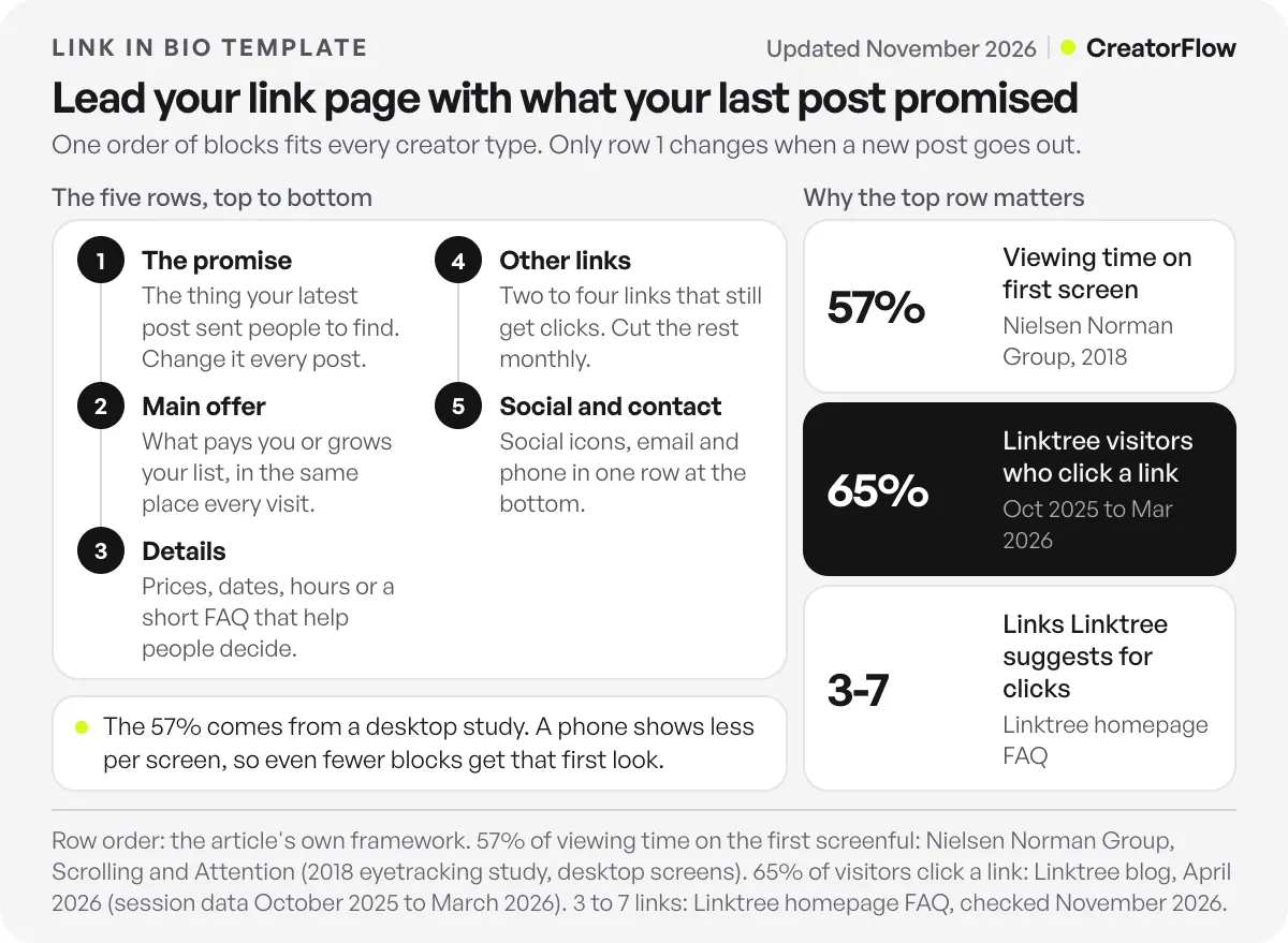
| Row | What goes there | How often it changes | Example |
|---|---|---|---|
| 1. The promise | The thing your latest post sent people to find | Every post | ”Get the meal plan from today’s Reel” |
| 2. Main offer | What pays you or grows your list | Every few months | ”Book a free 20-minute call” |
| 3. Details | Prices, dates, hours or a short FAQ | When facts change | ”How a call works, and what it costs” |
| 4. Other links | Two to four links that still get clicks | Monthly | Podcast, best guide, past roundup |
| 5. Social and contact | Social icons, email, phone | Rarely | Icons in one row |
The template is also a routine. The first time, you build all five rows. The second time, and the twentieth, you change only row 1 when a new post goes out. Once a month, open your page’s click data and cut any row 4 link that nobody taps.
The bio is not the only way to reach that top link. If your post says “Comment LINK for the guide”, CreatorFlow, our comment-to-DM tool, sends the same link by Instagram DM to everyone who comments LINK, in seconds, on every plan including Free. Here is how sending links by DM works.
What to Put in Your Link in Bio, and What to Leave Out
Put five things in your link in bio: the thing your latest post promised, your main offer, the practical facts people need before they act, a few other links that still get clicks, and your social icons at the bottom. Leave out anything a visitor would not tap this month, because every extra button competes with the one you want clicked.
Put in:
- Labels that say what happens, such as “Book a 30-minute call”
- A price or “free” on anything people pay for
- Dates on anything that expires
- One short FAQ block if the same questions keep arriving in your DMs
Leave out:
- Every social network as its own large button. One row of icons does the job
- Links that are older than your last three posts, unless they still get clicks
- Past events, ended sales and expired pre-saves
- A long biography at the top. Your Instagram bio already says who you are
Check one more thing before you build a page at all. Instagram’s Help Center lets you add up to 5 links to your profile and reorder them (checked November 2026). If you only have two or three destinations, that may be enough. If you sell, book or publish often, a link page gives each of those a proper block. Our link in bio vs website comparison helps if you are weighing a full site instead.
Building These Layouts on a Free More.You Page
From our team. More.You is a link in bio page builder built by the same team as CreatorFlow. Every layout in this article works on any link page tool, including the ones in our comparison of free link-in-bio tools. If you want to try one on More.You, its Free plan is free forever and includes one page with every block type, the full theme gallery and templates, QR codes and basic analytics for views and clicks, with 30 days of history (checked November 2026).
The block types map onto the layouts above:
- Links and social icons for the lower rows of every layout
- Products for the affiliate creator and the digital product seller
- Events for the musician and the event host
- Music pre-saves for the musician’s row 1
- Podcast episodes for the podcaster
- Bookings for the coach, the salon, the photographer and the trainer
- Opening hours for the cafe or salon
- FAQs for the question blocks in the coach, salon, product, photographer, fitness and event layouts
You can start from one of More.You’s page templates and reorder the blocks to match your layout, or browse pages people have published on More.You. If you already have a website or another link in bio page, More.You’s AI page generation can write the first version from it, or from one sentence about what you do. It keeps only the web addresses it found on your source, so it does not invent links, and nothing is saved until you approve it.
FAQ
What should I put in my link in bio?
Put the thing your latest post promised at the top, then your main offer, such as a booking, a product or a newsletter. Add one block of practical details like prices, dates or opening hours, then two to four other links. Finish with one row of social icons. Remove anything nobody has tapped in the last month.
How many links should a link in bio page have?
Linktree recommends 3 to 7 links when clicks are the goal, based on its most successful creators. Pages built to show a catalog, like a portfolio or a record label’s releases, can hold more. If your page has more than seven, group the extras under one heading or move them lower on the page.
What is a link in bio template?
A link in bio template is a fixed order of blocks that you fill with your own content. The 5-row template in this article is one example: the promise from your latest post, your main offer, details, other links, and social icons. Many link page tools also offer ready-made templates you can edit.
Should my link in bio match my latest post?
Yes. The top block should be the exact thing your latest post told people to find in your bio. A visitor who taps through from a post has one reason to be there. If that thing is not the first block they see, they have to search for it.
Do I need a link in bio page if Instagram allows 5 links?
Not always. Instagram lets you add up to 5 links to your profile, and a Meta One plan raises that to 20 on a link page. If you have two or three destinations, Instagram’s own links may be enough. A separate page helps when you need blocks like products, events, bookings or opening hours.
How often should I update my link in bio page?
Change the top block every time you publish a post that sends people to your bio. Review the rest once a month, remove links nobody taps, and check that dates and prices are still correct. The main offer in row 2 changes only when your offer changes.
What is a good click rate for a link in bio page?
Linktree reports that about 65% of visitors who reach a Linktree page click a link, based on its data from October 2025 to March 2026. Your rate depends on where visitors come from: in Linktree’s May 2026 data, visitors from Facebook clicked about half as often as visitors from Instagram or TikTok.
Sources and checks
Sources checked in November 2026: Linktree’s April 2026 trends post (65% of visitors click, more than half of clicks start on Instagram; data October 2025 to March 2026), Linktree’s May 2026 traffic study (click-to-view rates by source, May 2025 to April 2026), Linktree’s homepage FAQ (3 to 7 links), Nielsen Norman Group’s Scrolling and Attention (2018 eyetracking study), Instagram’s Help Center (up to 5 profile links) and Meta’s Help Center (Meta One link page, up to 20 links and a primary link). More.You plan details come from more.you/pricing and its feature pages. The 10 layouts are our own designs. Click rates vary by audience and traffic source.